The Washington Center for Equitable Growth (“WCEG”) is a research and grantmaking organization founded to accelerate cutting-edge analysis into whether and how structural changes in the U.S. economy, particularly those related to economic inequality, affect growth. Core to their mission is helping build a stronger bridge between academics and policymakers so that new research is relevant, accessible, and informative to the policymaking process.
The Washington Center for Equitable Growth had successfully grown its website and maintained a steadily increasing flow of traffic since their launch. Unfortunately, their website’s success had outpaced the development of core infrastructure and best practices. The website had two distinct blogs and an outdated design that wasn’t optimized for mobile.
The organization had built out several independent blogs within the website and a grant application process. The resources were fragmented and lacked a hierarchy, which made it difficult to navigate.
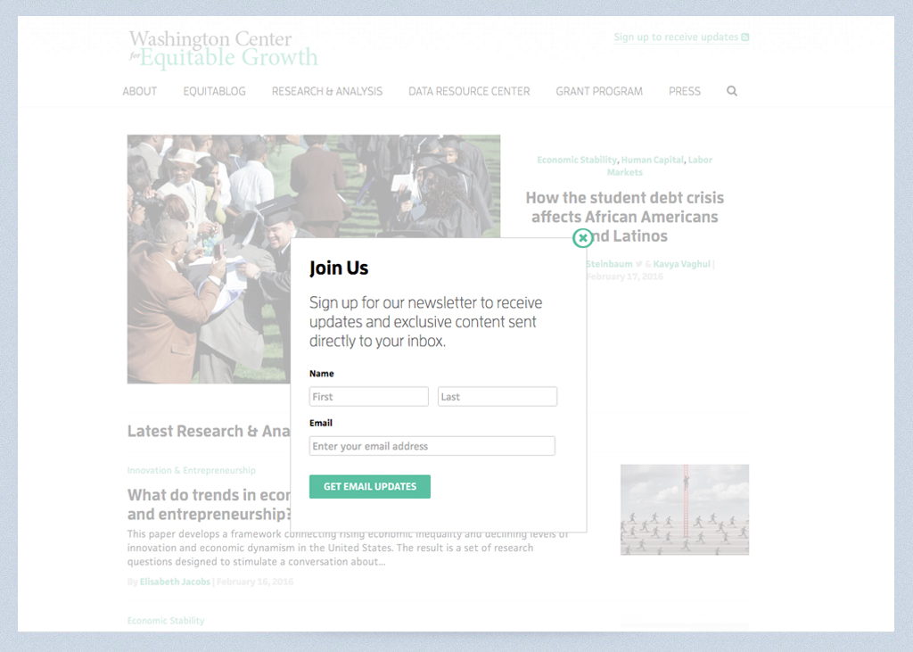
Pages weren’t designed to adequately support the text-heavy content, and the branding was inconsistent with the organization's mission to be cutting-edge. There were no touchpoints to engage with users and build their email list through on-site forms and call-to-actions.
In addition, the website wasn’t built around a solid strategy. Primary and secondary goals were unknown, and key performance indicators (“KPIs”) weren’t identified or tracked. Without a proper strategy in place, the website was poorly positioned for growth.
The organization reached out to PGM to redesign and redevelop the website, streamline their analytics, and create a scalable strategy for capturing value and optimizing their website on an on-going basis.
We started the project with a four-week discovery phase. We analyzed their Google Analytics; created user personas for the different demographics coming to the website; and surveyed stakeholders to identify pain points in the current strategy, technology, and website operations.
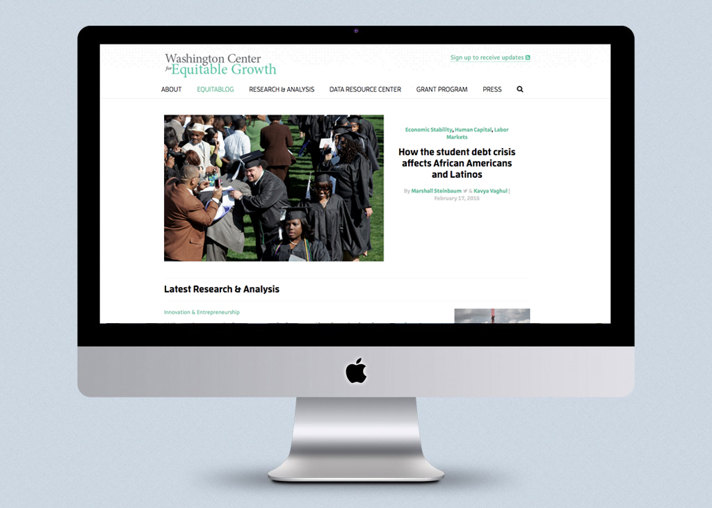
We started by removing all unnecessary clutter across the site. Special attention was paid to article pages, which drove approximately 70% of all traffic to the site.
For article pages, we used the optimal line length of 50-60 characters to determine how wide our reader’s viewport would be. Knowing some users skim articles while others consume them in their entirety, we created multiple touchpoints for social sharing.
First, we made the title section more prominent and added social-sharing features for easy access. Next, we consolidated the sidebar, removing “recent articles,” “about us,” and other media not relevant to our primary and secondary actions. In place of the sidebar, we added additional social-share functionality and a newsletter signup. For long-form articles, the social-share functionality in the sidebar remained fixed to the screen, traveling down the page as the user scrolled.
We paid special attention to aesthetics to ensure readers would have the most enjoyable experience possible. A custom font was introduced, different line heights were tested for optimal legibility, and negative white-space techniques were put into use to help keep the reader's eye on the content.
The result was a website that keeps users focused on the content -- making it easier to digest and discover articles in a seamless way. The site design is robust, intuitive, and optimized for all device types. We used content as a way to not only educate users but retain and attract new ones. Social-sharing functionality and email signup prompts are strategically located throughout the website in a non-obtrusive manner that lends itself to the natural ebb and flow of user behavior.
Reach out to start your project with PGM, today. Let's make progress happen.
Let's Get Started